For our A2 media product we were assigned to make a horror trailer, produce a horror poster or the film and a magazine cover. To begin with the project it was necessary to do research on horror films and trailers to have an understanding of generic horror films. We also wrote a treatment for the horror film so we had an idea of what the trailer would be like. The genre of our horror film was teen thriller and the plot was originally 5 friends go to a party, the lights go out and everyone there had disappeared and then weird thing start to happen to the group. However due to technicalities we reduced the group to 3 people.
Our horror trailer did use many conventions of a real media product as we used our understanding of existing horror films to give us some indication of what we were going to base our horror trailer on. In terms of camera shots, camera movement and transition I had done analysis of existing horror trailers and found that close ups, extreme close ups and medium shots were the most frequently used in trailer. We used extreme close ups and closes ups to create anxiety, we also used a bird eye view of the actor to increase the sense of being watched but being unaware of where the threat is, though this was not in my analysis I found that this shot occurred in both the orphanage and Eden lake two films we watched for research on horror films. Medium shots created a sense of isolation and loneliness this was an important element because the plot of our film is centred on the idea of isolation. With camera movements we didn’t uses many camera moments which is where we challenged common conventions of media products we did this to emphasise the feeling of being locked in, but we did move the camera sideways a few to times to show that the character was being followed. The transition we used were very typical of horror trailers, we used a lot of cuts and fades and text. What was common in horror films and trailers was the final girl theory, most of the trailers we watched there was a vulnerable girl scared, so we experimented with the idea of a man being the last person standing which rarely happens in horror trailers. Also by using a man it challenges the male gaze theory and that horror films are made for the enjoyment of men as in the 21st century many woman also like horror films so I think that the male gaze theory is quite out dated theory so by using a man we had to think in a way a male character will act in such situation and we created a character who thought quite logically and did most things right, we also made the male character so a male audience would possibly relate to the character. We edited our trailer in a non-linear way so the trailer show the exciting parts of the film and leave the audience wanting more which is how most trailers are edited. Much of our trailer is common conventions of a horror trailer. We choose to make our horror trailer quite conventional because we didn't want our trailer be too different that it was unrecognisable as a horror trailer.
Another part of our project was to combine our trailer with a magazine cover and horror poster, I think we successfully done this because the poster reflexes the trailer well. The poster showed the victims in a situation in the film, all the victims have a kind of pure white glow around them and from existing poster this was often used and I think this was done so the audience can identify who the victims are. The villan is also in the poster as a figure, the villian is never identify in both the trailer or poster to keep the villian unknown at all times. The magazine cover was a complete contrast to the horror trailer and poster, it was a picture of one of the actor as himself not as the character, and we took this approach because after looking at existing magazine covers it is often the actor as themselves and also we did this to conceal the identity of the killer in the horror film and by not making him the character it gives the audience no clues to if he is the one with the possession. Though that the magazine cover is very different from the other two media products I think that worked well because it allowed the audience to see a different side to the actor. I think this cover would be on a magazine like GQ or entertainment weekly magazine because it not only focuses on the character but also the actor. We choose to concentrate on the actor rather than the character, by doing this our target audience widens as it will also include people interested in the actor and their future projects , our magazine cover centres more on the celebrity side of the films rather than production. However I think it worked well because the actor promotes the film; also there are subheadings around the cover talking about their role in the film and other film related topics. The magazine is also a horror issue which relates to the whole horror production also we used a black and White background with a contrasting bold red and white text give the illusion of blood and also make it stand out.
Technology was vital in this project it was used in all stages of this production, firstly in the research stage i used sites such as youtube, wikipedia and imdb to find out about existing horror films and the similarities in horror films. As well as using youtube,i used exdxel to create bar graphs of how many times certain cameras movements, types of shots, iconography etc occurred in 4 different horror trailers, this was helpful in again looking at similarities and also how we could challenge and change our trailer to make it less formulaic. Having become more familiar with imovie it was easier to use, we used many fades to black and quick cuts to create the fast pace of the film, also the music we used was a repetitive drumming beat which got faster which was again to create the fast pace of the trailer. we also cut the music and put in a scream to emphasis the blackout scene and it also contrasts the previous scene. The trailer was not in liner order, this was something which occurred in many horror trailers, so most of the scariest bits was in the trailer giving the audience an injection of excitement therefore making them go an see the whole film and we felt that is was a relevant convention and we also use this in the trailer. We wanted our trailer to be quite polished in terms of the quality of the camera but instead some scene were blurred and hazy, this was not at first indented but putting the trailer together we found that the blur of the party scene created a feeling of people in a state of unconsciousness, which is something we wanted to portray as it is a teen horror, it showed an element of the fast moving teenage party scene. To improve our trailer i think that we could have used less text and from my audience feedback i found that others had the same view. To gather audience feedback i used surveymonkey to create a survey which is something i have used before and found that it has been useful in the past. The use of facebook allowed me to send my survey to friends and family and get feedback, also youtube has allowed people worldwide to look at the trailer and comment on it.
To conclude i think that overall our trailer was successful, having started production some scene had to be cut due to lack of resources however i think we overcame that barrier quite quickly and efficiently, and i was pleased with the end result of our trailer, magazine cover and poster.
Monday, 25 April 2011
Sunday, 13 March 2011


Sunday, 30 January 2011
Audience feedback Evaluation
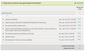
From the results of my survey everyone knew what the film was about and also didn't think it gave to much away, which is good as the purpose of trailers is to give a little idea of what the film is about without giving away too much, but still putting exciting footage of the film in. I think our trailer was successful in this department. 5 people said they would see the film, 5 said they would and 2 said they wont, this suggests that there our trailer can be improved or maybe that the sub genre of our horror trailer was not to everyone taste. 5 people thought the trailer was effective and 2 people didn't, this tells me that the trailer may not have given everyone the trill which horror films do. The comments people left about what people thought was good was mainly camera shots and quick cutting, which is what we were trying do so that the trailer didn't look linear but was always exciting. Finally what people thought could be improved was the camera quality, music and less use of text, I agree with the less use of text i think we could of used more dialogue however i think by not having as much dialogue it gave the trailer a sense of mysteriousness.
Audience Feedback
To get audience feedback i made a survey and sent it to friends and family here are the results:


Poster Ideas
Here are idea we came up with for poster ideas:


(Poster 1) (Poster 2)


(Poster 1) (Poster 2)
Poster 1- I think this poster was effective because it shows all three characters and also has a the figure of the possessed one in a door way, doing this gives you an idea of what the film without giving to much away. This poster is quite busy which isn't really on horror posters.
Poster 2- This poster has one character and the possessed one covering there mouth, this poster has a stronger sense of the unknown than poster 1 which is relevant for a horror film and it is very simple too, however i think this poster doesn't tell the audience anything about the film.
Tuesday, 11 January 2011
Thursday, 6 January 2011
Existing horror poster and magazine covers
As part of my A2 coursework we had to design a poster and magazine cover for our trailer.
Looking at existing horror film posters and magazine covers, i have found that elements which are very common in horror film poster. However for the magazine cover i found that man and woman are portrayed differently on magazine covers. Here are some examples of this:


Both actors are promoting similar types of films, but they are portrayed in completely different ways. The character that Hugh Jackman plays is a strong character, so is the role that Halle Berry takes on but the cover doesn't show her as cat woman but as an actress whereas Hugh jackman is shown as wolverine his character. It seems they when woman are on the front cover of a magazine promoting a feel magazines use sex appeal to act tract audiences, evidence of this can be found with actresses such as Megan fox and Angelina Jolie. Looking at the wolverine cover Hugh Jackman is his character and the cover is more about the film, this is similar with actors promoting film such as Danial Craig who is Jame Bond on the cover. From these examples it seen that magazines use woman and men completely differently to attract audience.
Horror Posters

These posters have many similarities, firstly both have woman on the cover and they both have a white glow then which seen to suggest a kind of purity especially in the orphanage as she is holding a child. Also they they is a sense of the unknown and the idea that someone is trying to find to in both posters, on the orphanage there are arms trying to get to her and on the Eden lake poster there are figures in the background. Both posters are dark with a hint of red on them, this may resemble life lost in the films as people to die in both films. I thought both posters were effective because they give an element of what the film is about but don't give to much away.
Subscribe to:
Comments (Atom)